Have you ever walked into a physical store and left within ten seconds because you couldn’t find what you were looking for or because the salesperson didn’t even greet you? The exact same thing happens in the digital world, but amplified. I am Peter Cuber, Project Manager at WeLoveWeb, and after years of managing digital projects, I have come to an unshakeable conclusion: beautiful design is useless if it doesn’t sell.
Today I want to talk about something we are passionate about in the office: UX for sales web design. It’s not just about adding colorful buttons; it’s about psychology, understanding the user, and making their path to the “checkout” easy without them even realizing it.
Why UX is the Invisible Engine of Your Business
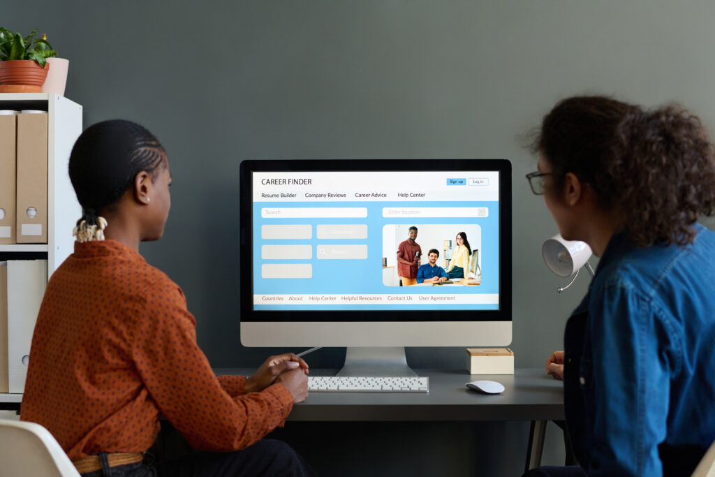
When we talk about UX for sales web design, people often think of dropdown menus or how fast an image loads. And yes, that’s part of it, but User Experience (UX) is, in reality, the promise of value delivered. If you promise an incredible product in an Instagram ad and your website is a labyrinth, you have broken that promise.
In my daily work as a Project Manager, I see companies investing thousands of euros in traffic but neglecting their digital home. It’s like inviting a hundred people to dinner and having the kitchen in disarray. The key is to create an environment where the user feels secure, guided, and, above all, understood.
The First Impression: The 3-Second Threshold
The average user decides whether to stay on your website in less time than it takes you to say “conversion.” That’s why, among the web design trends for 2026, speed and visual clarity are non-negotiable. If your page takes too long to load, the user will go back to Google and click on your competitor. It’s that cruel and that simple.

Pillars of a Winning UX Strategy for Sales Web Design
For a corporate website to work, it must be designed with a clear commercial purpose. Here are the points we always audit in our corporate web design projects:
1. Visual Hierarchy and Scannability
Nobody reads on the internet: We scan. Therefore, UX for sales web design must make it easy for the eye to find the hot spots: the main benefit, the price (if applicable), and the call-to-action button.
- Use the F or Z pattern: Humans read this way on screens. Put the most important information at the top left or following the eye’s trajectory.
- Contrast: Your “Buy” or “Contact” button cannot be gray on a gray background. Give it life.
2. Intuitive Navigation (Don’t Make Me Think)
As Steve Krug rightly says in his usability bible, the maxim is: “Don’t make me think.” Good UX for sales web design is one that allows a user to reach the product in fewer than three clicks. According to studies, consistency in design reduces cognitive load, allowing the user to focus on buying, not on learning how to use your website.
3. Microinteractions that Build Trust
A microinteraction is that small visual change when you hover over a button or the green checkmark that appears when you fill in a field correctly. These details may seem minor, but they reduce user anxiety and confirm that they are doing things correctly.

Authority and Trust in Design
On Google, and in life, trust is everything. For UX for sales web design to be effective, we must demonstrate that we know what we are talking about. It’s not enough to say you’re the best; you have to prove it.
- Social Proof: Include real testimonials, client logos, and certifications.
- Transparency: Make it clear who you are. An “About Us” page with real team photos (hello from the WeLoveWeb team!) generates much more trust than a stock photo of smiling people in a Swedish office.
- Security: Make sure your site complies with the web security guide for businesses. An HTTPS padlock is the minimum, but secure payment seals are what close the sale.
Adaptability: The World is Mobile (and So Should You Be)
It’s nothing new, but I’m surprised how many websites still fail at this point. UX for sales web design today is, essentially, mobile design. It’s not enough for the website to “look good” on mobile: It has to be easy to use with your thumb.
Buttons should be large enough (minimum 44×44 pixels according to Apple’s guidelines) and forms should prevent the user from having to zoom in to type. Remember that poor mobile design is the biggest conversion killer in advertising campaigns.
The Technical Dilemma: WordPress or Custom Development?
Many clients ask me about the price of a professional website in Spain and whether it’s worth investing in development from scratch. My answer always depends on the objectives, but for most businesses, an optimized WordPress-based solution offers a perfect balance.
However, with the rise of artificial intelligence, we are seeing a shift. You can read more about this in our article on WordPress vs. AI Development. The key is that technology must serve UX for sales web design, and not the other way around.
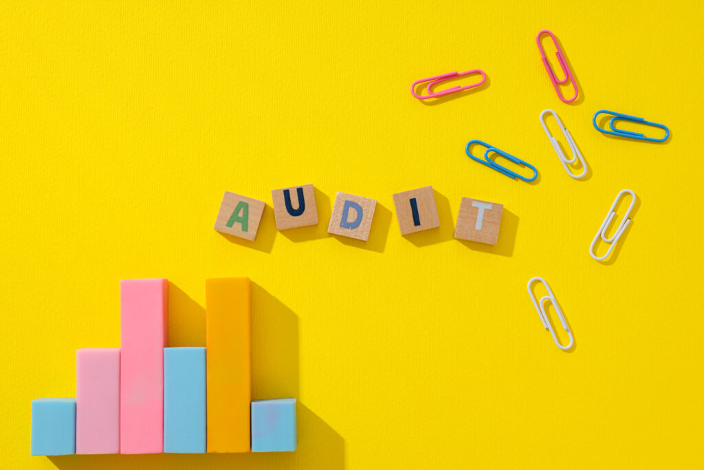
Practical Tools to Audit Your UX Today
If you want to know if your website is losing money due to a poor experience, I recommend these tools that we use at WeLoveWeb:
- Hotjar: To see heatmaps and user recordings. You’ll be surprised to see where people get stuck.
- Microsoft Clarity: A free tool from the creators of Windows, which allows you to visualize user interaction with your website: Clicks, heatmaps, attention areas, etc.
- Google PageSpeed Insights: Vital for measuring technical performance that directly affects UX.
- Baymard Institute: If you have an e-commerce site, consult their research on the checkout process. They are the global authority on why carts are abandoned.
Tips for a Drama-Free Redesign
If you’re thinking your website needs a facelift, before diving in blindly, analyze your data. A redesign should be based on identified problems, not just on “wanting something new.”
Sometimes, a simple change in button copy or the order of menu elements can skyrocket revenue. If you notice that your bounce rate is very high, perhaps it’s time to consider when to undertake a corporate web redesign. Don’t wait for your competition to overtake you with a faster, more usable website.
Conclusion: The Design That Sells is the Design That Cares for the User
Ultimately, UX for sales web design is not a decorative luxury: It is a strategic necessity. As a Project Manager, my goal is always for the client to recover their investment as soon as possible, and usability is the shortest path to achieving this. Paying attention to every detail, from typography to loading speed, makes the difference between being just another website in Google’s index or being the solution your client was looking for.
Remember that your website is your best salesperson: It works 24/7, doesn’t get tired, and can serve thousands of people at once. Make sure it has the right tools to close the sale.
Do you need to boost your digital presence?
At WeLoveWeb, we don’t just create beautiful websites; we build sales machines. If you feel that your current website is not reflecting your business’s potential or if your marketing campaigns are not converting as they should, we are here to help.
Our team of digital marketing and web design experts will analyze your case to offer a customized solution that prioritizes your return on investment. Let’s talk and make your website start working for you.
FAQ: Frequently Asked Questions about UX and Sales
UI (User Interface) is what the user sees (colors, fonts, buttons), while UX (User Experience) is what the user feels and how they interact with the site to achieve their goal. In sales, UI attracts, but UX is what closes the transaction.
It depends on traffic, but for critical changes (such as optimizing checkout or speed), conversion rate results are usually visible almost immediately or within the first few weeks of data analysis.
Absolutely. Google uses metrics such as Core Web Vitals and dwell time to determine if a website is useful. Good UX for sales web design reduces bounce rate, which indicates to Google that your content is high quality.
While there are basic changes you can make yourself, an expert can detect invisible frictions through user testing and data analysis that multiply the impact of improvements.
Brevity. The fewer fields you request, the higher the conversion. Only ask for what is strictly necessary to initiate the business relationship and use real-time validation to avoid annoying errors.