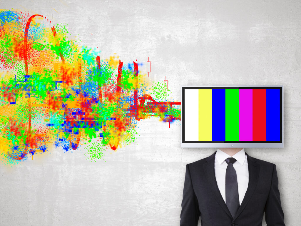
Hello! I am Peter Cuber, Project Manager at WeLoveWeb. If you are here, it is because you suspect that the colors on your website are not just a matter of “looking nice”. And you are absolutely right. In 2026, with a digital market more saturated than ever, color psychology in web design has become one of the most powerful (and sometimes underrated) tools for guiding user behavior.
Throughout my career managing corporate web design projects, I have come across clients who choose their website’s color simply because it is “their favorite color”. That is a mistake. At WeLoveWeb, we do not design for the business owner; we design for their customers. In this article, I would like to break down how the brain processes visual stimuli and how you can use color psychology in web design so that your conversion rate stops being a mystery and starts becoming a success.
The invisible impact of color psychology in web design
Did you know that it takes humans less than 90 seconds to form an opinion about an online product? What is most striking is that between 60% and 90% of that assessment is based solely on color. Color psychology in web design is not esotericism; it is applied neuroscience.
When a user enters your site, their limbic brain reacts before they can even read your value proposition. If your website sells security services but you use a loud bubblegum pink, you are sending contradictory signals. Visual consistency builds trust, and trust is the foundation of all sales.
To understand where we are heading this year, I recommend taking a look at Web Design Trends 2026: A Guide for Businesses, where saturation and chromatic minimalism play key roles.
What emotions does each color evoke in your audience?
Not all colors serve the same purpose. Applying color psychology in web design requires understanding the cultural and psychological meaning of each shade. Here is a breakdown of what we see in projects that perform well in 2026:
Blue: The king of trust
It is the most widely used color in the corporate, banking, and healthcare sectors. It conveys calm, security, and professionalism. If your business depends on customers trusting you with their data or their money, blue is your best ally. However, be careful not to overdo it: too much blue can feel cold and distant.
Red: Urgency and passion
Red increases heart rate. In color psychology in web design, we reserve it almost exclusively for calls to action (CTAs), last-minute offers, or errors. It is a color that demands immediate attention. A red “Buy now” button often converts better for impulse-purchase products.
Green: Health and sustainability
In 2026, when environmental awareness is at its peak, green has gained remarkable ground. It conveys growth, freshness, and ethics. It is ideal for companies in food, rural tourism, or renewable energy.
Black: Luxury and exclusivity
Black is the color of elegance par excellence. If your brand is positioned in the premium segment, black (especially when combined with gold accents or very clean typography) signals that you are not for everyone, but for a select few.
To dive deeper into how these elements affect interaction, do not miss our post on User Experience (UX) as a driver of sales, where we explain that color is only one piece of the usability puzzle.
How to apply color psychology in web design based on your industry
Designing for a law firm in Madrid is not the same as designing for a surf shop in the Algarve. Color psychology in web design must be adapted to the context.
B2B and professional services
Here, we look for stability. Palettes of bluish greys, clean whites, and a strong accent color (such as orange or lime green) usually work wonderfully. Grey adds a sense of seriousness, while the accent color guides the eye towards the contact form.
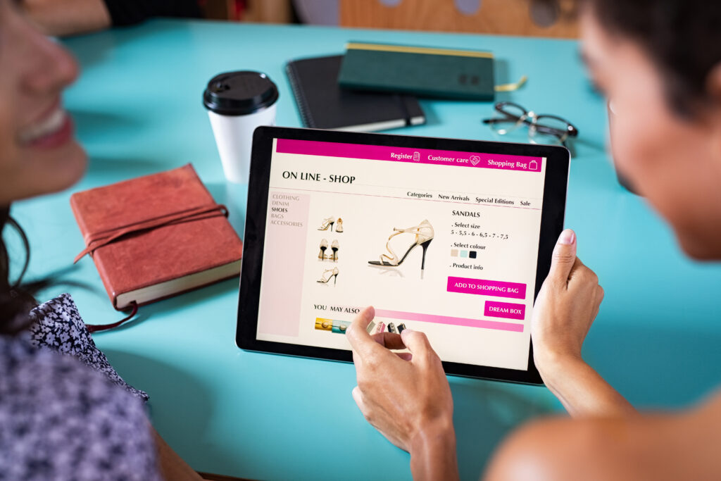
E-commerce and retail
In online shops, the product color should be the star. That is why the background is usually white or very light grey. Color psychology in web design is applied here to the “Add to cart” buttons. According to studies on visual psychology, contrast is more important than the color itself for conversion.
Health and wellness
Pastel tones, turquoise, and white convey cleanliness and calm. Avoid red (blood, danger) at all costs in this sector, unless you are a blood donation unit.
The 60-30-10 rule: Balance and visual hierarchy
As a Project Manager, one of the most practical tips I give my clients to master color psychology in web design is the 60-30-10 rule. It is an interior design technique that works perfectly on the web:
- 60% Primary Color: Generally the background color or the most neutral one. It holds the structure together.
- 30% Secondary Color: Creates contrast and supports the primary color. It is used in text blocks, menus, or secondary sections.
- 10% Accent Color: The “bright” color. It is reserved for what matters most: your conversion buttons.
If you use the same color for the background and the purchase button, users will get lost. Color psychology in web design teaches us that the eye naturally looks for the element that breaks the chromatic monotony.
If you would like to see how we apply this on specific landing pages, I invite you to read how to design a Landing Page that converts visitors.
Accessibility and contrast: The ethical and legal obligation in 2026
We cannot talk about color psychology in web design without mentioning accessibility. In 2026, Google penalizes (heavily) websites that are not inclusive. According to the W3C web accessibility guidelines (WCAG 2.1), we must ensure a minimum contrast ratio of 4.5:1 for normal text.
Having a beautiful color palette is useless if a person with color blindness or low vision cannot read your content. Tools such as the Adobe Color Accessibility Wheel are essential for checking whether your palette works for everyone. Remember: a website that cannot be read is a website that does not sell.
Tools to master color psychology in web design
So that you do not feel lost, here are the tools we use day to day at WeLoveWeb to choose winning palettes:
- Coolors.co: Ideal for generating quick palettes and seeing how they work together.
- Picular: The “Google of colors”. You type a word (e.g., “Coffee”) and it returns the colors most associated with that concept.
- Khroma: An AI tool that learns your preferences and suggests combinations based on color psychology in web design.
Real-life results and experience at WeLoveWeb
Recently, a client in the online education sector asked us to redesign their platform. Their main color was a very dark grey, almost black. Users felt “overwhelmed,” and the course drop-off rate was 45%.
We changed the strategy by applying color psychology in web design: we introduced a light blue for reading areas and a vibrant yellow for the “Next lesson” buttons. The result was a 20% increase in time on site and a substantial improvement in student ratings. Color changed the perception of learning: from something “heavy” to something “stimulating.”
Academic research supports that color affects not only emotion, but also real purchase intent. At WeLoveWeb, we do not leave this to chance.
Conclusion: Color is your silent language
Mastering color psychology in web design means understanding what your customer feels even before they know what you sell. It is the difference between being just another website in their browsing history or being the solution the user was looking for. Do not choose your colors based on trends; choose them based on strategy.
Remember that your visual identity must be consistent across all channels. If your website communicates one thing and your social media another, trust breaks. Design is, ultimately, communication.
Do you need a design that truly connects with your audience?
At WeLoveWeb, we know that your business is unique, and your website must reflect that. We do not settle for generic templates; we analyze your market, your competition, and, above all, your ideal customer to apply color psychology in web design in a way that makes your brand stand out and convert.
If you are looking for a team that combines creativity, technical expertise, and a clear business vision, you are in the right place. We want to help you make your corporate web design your best salesperson, working for you 24 hours a day.
Take your business to the next level today
Do not leave your company’s success to luck. Request a consultation with us now and discover how we can transform your digital presence. We will analyze your current palette and usability, and propose an action plan so that you start seeing real results.
👉 Click here to discover our professional web design services
FAQ: Frequently asked questions about color psychology in web design
There is no universal answer, but orange and red often work best due to their high contrast and sense of urgency. The most important thing is that the button color is not used in any other element on the page, so it stands out above everything else.
Dark mode reverses perception. Vibrant colors stand out much more and convey a sense of modernity and technology. However, saturation must be adjusted to avoid visual fatigue, a key aspect in today’s color psychology in web design.
It depends. You should use colors your industry recognizes (to build trust), but with a nuance or an accent color that differentiates you. If all your competitors are blue, perhaps a blue with a hint of coral will help you stand out without losing your industry authority.
Studies suggest slight preferences (such as blue being the favorite for both, but women tending to reject orange more), but in 2026 we focus more on the psychographic profile and search intent than on gender.
If the website is well built with CSS variables, it is a quick process. The hard part is not changing the code, but deciding which colors to use after a serious analysis of color psychology in web design. At WeLoveWeb, we routinely carry out this type of brand image audit.